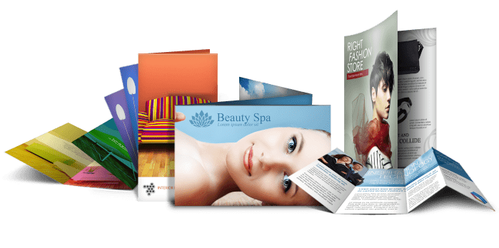
Your brochure is often a prospective customer’s first interaction with your business. They’ll make decisions on you, your company and ultimately, whether your business is right for them; all based on what they see in those pages.
Therefore it’s vital to send the right message. With that in mind, you should probably ask yourself a couple of questions even before you think about the design and print of your new brochures: What’s the purpose of my brochure?
Are you selling products or services directly? Or maybe you just want to introduce your company, directing prospective customers to your place of business, whether online or on the high street.
Who is my brochure aimed at? Are you talking to other businesses or to the public? Or both? Does your target market already have knowledge in your field or do they need introduced to, or educated on your products?
Whatever your answers, here are a few tips to help you make the right decisions on your Virginia printed brochure.
1.- Make a good first impression.
From your brochure, through to your marketing material and your stationery, peoples’ first impression will be the most important factor in whether or not they work with you. Your brochure has to be professional, from the front cover to the back.
Choose the right paper to compliment your design. Online Quality Printing in Virginia offers an extensive range of quality and luxury paper which will really make your brochure stand out.
Think about how you want your brochure bound: Saddle stitching is great for brochures, reports and magazines. Perfect bound might be your best option for thicker magazines and catalogues. Wiro bound is perfect for manuals, presentations and reference documents, while folded leaflets are great for shorter, compact marketing material.
Keep it simple. Put your readers first. Remember, your brochure is aimed at your customers, not your own company. Use well written copy that will be easily understood by your target market. Avoid jargon. Phrases and terms you use within your company may mean little to others. Limit your fonts.
A variety of fonts and sizes will look much too busy and put people off reading your text, however well it’s written. Use a clear and consistent layout too. Make it easy to read and to follow.
Use great images – real images. Avoid stock photography. Don’t fall into the trap of filling all available space with generic pictures.
That tanned, smiling family or business team might look great in Florida, but do we really look like that in Virginia?
Keep your images relevant and real, and remember, every space in your printed brochure doesn’t need to be filled with pictures. Clean space can be hugely effective.
Don’t blow your cover! It’s the first thing your readers will see, so make sure your brochure cover looks professional and entices them to open up!
Check out our website to see our range of papers, finishes and printing techniques to make your cover send out the perfect message. Great design and print is design and print that works. Our team of experts are always happy to help with your brochure printing and marketing material, but great design and well written copy are vital in making your brochure a success.
Contact us or visit our onlinequalityprinting.com for help and advice on getting the very best results from your printed brochure in Virginia.


